It was a bit of a seesaw week in the stock market, but, overall, the market seems to think everything is looking good.
The May employment report indicated that the change in Non-Farm Payrolls (NFP) was stronger than expected. It came in at 272,000, significantly higher than the estimated 190,000. The unemployment rate climbed to 4%, and wages rose 4.1% in the past year.
The market’s initial reaction? Well, treasury yields spiked after the report was released, and equity futures turned sharply lower. However, that didn’t last long. At one point, the S&P 500 reached a new all-time high but closed lower. The number of added jobs weakens the probability of an interest rate cut. But isn’t that what the market is expecting? Long-term, things are looking fine. Let’s take a closer look.
Starting with the weekly chart of the S&P 500 ($SPX), it’s clear the trend is still bullish, as is momentum (see chart below). Until this changes, there’s no reason to think equities are setting up for a significant selloff.
CHART 1. WEEKLY CHART OF THE S&P 500 INDEX. The bullish trend is still intact and momentum continues to be strong.Chart source: StockChartsACP. For educational purposes.
The weekly perspective remains strong, with the S&P 500 trading above its 21-week exponential moving average (EMA). The index bounced off its 21-week EMA (red line), and, with the exception of a reversal last week—which didn’t put much of a dent in its bullish path—it continues to trend higher.
The Linear Regression Forecast (LRF) indicator (blue line) also indicates an upward trend. Since the LRF is based on the line of best fit, it can be considered a good indicator to measure the near-term trend. The last point of this indicator forecasts price direction, which, in the weekly chart, points higher.
Momentum also seems strong, with the moving average convergence/divergence trending higher and the stochastic oscillator well in overbought territory. So, from a weekly perspective, the S&P 500 looks bullish.
Does the picture change on the daily chart? Let’s take a look.
CHART 2. DAILY CHART OF THE S&P 500 INDEX. It may be a little more choppy than the weekly chart, but the trend is still bullish, and the momentum is strong.Chart source: StockChartsACP. For educational purposes.
The daily chart is a little more choppy than the weekly one, but it still suggests the S&P 500 is trending higher. The market had a bumpy ride at the end of May, but it recovered.
Watching a breadth indicator to see if it supports the trend is a good idea. There are several breadth indicators available in StockCharts.com, such as the Advance-Decline Line, McClellan Oscillator, and the Bullish Percent Index (BPI).
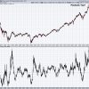
The chart below displays the BPI for the S&P 500. When the BPI is above 50, it indicates that bulls have the edge, with 70 representing overbought levels and 30 oversold, although you can use different thresholds.
CHART 3. S&P 500 BULLISH PERCENT INDEX. The BPI indicates the S&P 500 is still bullish.Chart source: StockChartsACP. For educational purposes.
It’s interesting to note that the S&P 500’s BPI hasn’t been below 30 since the end of October. This suggests that the overall market continues to be bullish.
Another confirming indicator is the Volatility Index ($VIX), which continues to be low. Investors are not showing any signs of panic.
Bond Market Action
One interesting piece of the stock market puzzle is the bond market, which tends to move on the jobs data. With yields coming down, bond prices started to move up. The daily chart of the iShares 20+ Year Treasury Bond ETF (TLT) below shows that TLT broke out above its downward-sloping trendline and broke above its last significant high (May 16). But Friday’s price action sent Treasury yields higher, and bond prices fell below their May high.
CHART 4. DAILY CHART OF ISHARES 20+ YEAR TREASURY BOND ETF (TLT). After breaking above its last high, bond prices declined. It remains to be seen if this is a correction or a sign that bonds are still struggling.Chart source: StockChartsACP. For educational purposes.
While one day’s action doesn’t signify a trend reversal, it’s a good idea to watch the action in the bond market. Add this chart to your ChartLists and keep an eye on whether TLT breaks above its May high. If it does, it could further confirm that bonds are trying to come off their lows.
Another point not to be missed is the action in the US dollar, another asset that reacts to jobs data. The greenback spiked in today’s trading. So, we have a situation where bond yields spiked, the dollar spiked, and equities were relatively flat. On the other end of the spectrum, metals got clobbered. Do metal traders know something about the inflation data?
Everything rests on next week’s action, which is a data-heavy week. There’s the Consumer Price Index (CPI) and FOMC meeting. Given that today’s jobs data showed that wages data came in higher, you can bet the CPI data will be watched closely.
Let’s see what the Fed says next week. The CME FedWatch Tool shows a small probability of a rate hike in the September meeting, but that could change. The key point to listen for is whether inflation is coming down at the rate the Fed wants to see. The market has priced in one rate cut possibility this year. If we hear otherwise, the market could react either way.
The Takeaway
Technical indicators look good, which suggests that the stock market is still bullish. But watch market breadth and the VIX. If they start to turn—it has to be a significant reversal—then you can start worrying. In other words, if you think the stock market is toppy and it’ll sell off, wait for the confirming indicators to show you the market will sell off.
End-of-Week Wrap-Up
S&P 500 closes down 0.11% at 5,346.99, Dow Jones Industrial Average down 0.22% at 38,798.99; Nasdaq Composite down 0.23% at 17,133.13. $VIX down 2.86% at 12.22 Best performing sector for the week: Technology Worst performing sector for the week: Utilities Top 5 Large Cap SCTR stocks: NVIDIA (NVDA); MicroStrategy Inc. (MSTR); Super Micro Computer, Inc. (SMCI); Vistra Energy (VST); Applovin Corp. (APP)On the Radar Next Week
May CPI Federal Reserve’s interest rate decision and press conference May PPI June mortgage rates June Preliminary Michigan consumer and inflation expectations Fed speeches (Goolsbee, Cook)Disclaimer: This blog is for educational purposes only and should not be construed as financial advice. The ideas and strategies should never be used without first assessing your own personal and financial situation, or without consulting a financial professional.


